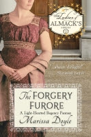
I don’t know about you, but I love Marissa’s fashion posts.
It’s fun to see how things changed over the course of the nineteenth century.
But clothing isn’t the only thing that changes with time. What’s popular in
book covers also changes over the years. That’s one of the reasons I decided to
update the covers on my Lady Emily Capers. So, join me on a walk down memory
lane. 😊
 Secrets and
Sensibilities was originally published by Kensington as a traditional
Regency romance. I’ve edited and rewritten parts since. Here was the first
cover (and title--A Dangerous Dalliance).
Art and Artifice
began life as La Petite Four
(actually, it began life as Diary of a
Duke’s Daughter, but my publisher Penguin Razor Bill didn’t care for that
title). I heavily rewrote it after the rights were reverted. Here was the first
cover (before the addition of a necklace on the young lady):
When I finished the series on my own, I had silhouette
covers created for all five books. To me, they caught the campy fun of the
stories and hinted of both mystery and romance. But it was terribly hard to
find full silhouettes of ladies in Regency garb, so the looks vary from
Georgian to Victorian and even beyond. And they didn’t really shout “If you’re
a teen, you might enjoy these too!”
Secrets and Sensibilities was challenging for me, because, as I’ve mentioned,
the character of Hannah Alexander was based on a dear friend who has since
passed away. This model has Nancy’s sleek chocolate-colored hair, pale complexion, and big brown
eyes.
Almost as challenging was finding the right Lady Emily for Art and Artifice. Emily
describes her nose as pointy and her hair as occasionally frizzy. Difficult to
find frizzy-haired models. 😊
But I liked the nose on this young lady.
Priscilla Tate in Ballrooms and Blackmail was easier—just look for the most gorgeous blonde I
could find. I think she’d approve of the girly colors as well. (Much more so
than Emily, who had apoplexy about her original pink cover.)
Ariadne Courdebas in Eloquence and Espionage took a bit of work. She is the plumpest of the young
ladies, and the most well-read. I liked the intelligence in this young lady’s
face as well as the smoky background my cover artist used.
Ah, her sister Daphne! How to portray our Amazon in Love and Larceny? This model had a nice
“girl next door” look that worked for the most athletic of the group.
So, what do you think? Did my cover artist, the talented Kim
Killion, capture the characters the way you imagined them?


4 comments:
I like the silhouette covers. They allow me to imagine the characters' faces. I don't like the ones with real people (even though pretty 19th century dresses always catch my eye) the people look too modern and don't always match how I imagine the characters. I don't like illustrations for the same reason. I searched for the "right" Pippi Longstocking book to gift my niece and settled on the one I read as a youngster with black and white illustrations. That way she could decide for herself what color red (orange) hair Pippi has. None of the other color illustrations looked right to me.
I like the silhouette covers too, QnPoohBear, but some online venues refused to consider them YA, and I'd like to appeal to that audience too. Often times, I don't even look at a cover once I buy the book, then I glance back and think, woah, her hair was brown? I so pictured her a redhead. LOL
I grew up reading Regencies (45 years ago!) I liked the old style covers, the artist's vague rendering left some latitude in interpretation (especially when the character had brown hair and the cover was a blonde!). I also liked your silhouette covers. I'm not so fond of the newer cover styles, but if you think that the ladies faithfully represent your characters, so be it. I think your cover artist has done a nice job with them, and as I do understand the market is different today, I hope they help you reach your target audience.
Thanks, Chemystress. Me too!
Post a Comment