 Summer’s winding down, but Marissa and I are swamped with deadlines and family demands. We’ve written so much about nineteenth century vacation spots this summer that we’ve decided to take a little vacation ourselves! This will be the last post until after Labor Day. Expect to see Marissa back at her desk on September 6. And September is birthday month at Nineteenteen, so expect some fun surprises as well.
For now, I’d like to talk about covers. Covers? Yes, really, book covers. We’ve talked before about where a young lady in nineteenth century London would have gone to purchase a book and what that book would have looked like. If you bought the new title page and folios for Jane Austen’s latest (written then “by a Lady”), you’d take them to a bookbinder and have them set up with covers and spine. Then, of course, your choice was various colors of calf’s skin and other types of leather. Take, for example, the picture of this first edition, with tan covers, black leather insets on the spine, and gilded lettering.
I am fortunate to own one book, in two volumes, that dates from 1809: John Harriott’s Struggles Through Life. Though the cover has seen better days (hey, they’re over a 100!), you can see that it was once a nice brown leather with red insets on the spine.
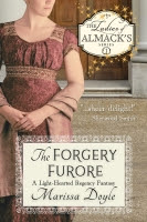
 Now, of course, our books have more options. Marissa’s hardbacks have wonderful paper covers of paintings of her twin heroines. Paperbacks have even more leeway, with the possibilities of step backs (a picture inside the cover as well as on the front), embossing, and cutouts. That means, however, that cover artists have to be employed to bring the essence of the novel to life on the cover.
Rarely is an author able to sit down with the artist and talk about the novel. At best (and Love Inspired in among the best, in my experience), you can provide examples: pictures of settings, perhaps even swatches of fabrics for gowns. Alas, authors are often word creatures; no matter our best intentions, what we describe often doesn’t translate well to the visual medium of a cover. (That’s part of the joy of reading—the story is transformed in each reader’s mind.) But sometimes, it all comes together.
You know I was pretty thrilled with the cover of my June release, The Irresistible Earl. I’m even more delighted with the one for November’s release, An Honorable Gentleman. In my fact sheet that goes to the artists, I said my hero looked a bit like Brandon Routh, and I suggested it might be nice to have him gazing out over his new estate in the Lake District. You saw some of its beauty in last week’s post. Here’s the result:
 I think they captured it pretty well. A friend even went so far to say it was a pretty “hot” cover for an inspirational romance. :)
This month, however, I had a unique opportunity. I decided I wanted a new cover for my oldest book, The Unflappable Miss Fairchild, which is available as an e-book reprint through Belgrave House’s Regency Reads line. I convinced my publisher to let me take it to a new e-book cover designer, Iconic Shadows. One of the main photographers is an avid reader and a fan of my books, so I knew she “got” me and my stories. She interviewed me about my hero and heroine, settings of the book, the tone and feel, what I wanted the cover to achieve, and other aspects. Then she did a photo shoot. Here’s the result:
 The heroine is spot on, the background perfect. I love the fresh, upbeat feel of it.
I must say, though, that I’m curious about how others will take these covers. After all, I know the story inside them; a reader picking them up (or perusing online) won’t have that knowledge. What do you think, about either cover? Would they encourage you to make a purchase? What do you like or dislike about them? What kinds of covers cause you to pick up an author you’ve never heard of before?
I’ll be about the next two weeks and will try to respond to any comments. Until September—happy reading!


