Showing posts with label art. Show all posts

Tuesday, June 25, 2019

The Universal Advertising Sheet, Part 3


Let’s see what interesting shreds of personal and social history we can read about, courtesy this week of the Monthly Compendium of Literary, Fashionable, and Domestic Advertisements from the March 1, 1807 edition of La Belle AssemblĂ©e...

First, another Jane Eyre moment:


EDUCATION.
The attention of Parents and Guardians is requested. A Lady is desirous of taking ONLY TWO young ladies, from three to eight years of age, to instruct with every comfort and advantage of paternal Education; she does not propose giving any Holidays –Letters (post paid) addressed to A. Z. Post Office, Laytonstone, Essex, will be duly answered.

Well. I said this sounded like a Jane Eyre moment...but from whose point of view? No holidays? That seems a tad harsh for students of pre-school and elementary age, I think; A.Z. was quite the taskmistress.

These advertising supplements are full of ads for hair products (in this issue, there’s one for Russia Oil, for the growth of hair...but here’s one for a stylist, which I found interesting. Cropped hair was still quite fashionable, and would be yet for another few years:

VICKERY
Ladies’ Head Dress Maker and Hair Cutter, No. 6, Tavistock-street, Covent-garden,
has the honour to acquaint the Nobility and Gentry, that he has completed an assortment of elegant Head-Dresses; that need only to be seen to be approved of.
The Royal Crop is a specimen of superior elegance.
Ladies that honour him with their commands, will please to say, if for young, middle aged, or elderly Ladies. The price from two to five Guineas.
Gentlemen’s Crops made to a perfection in fitness very rarely to be met with, at two Guineas and a half.
The Nobility and Gentry’s hair cut with every attention to style and the improvement of their hair.
Ladies and Gentlemen will please to give their servants very particular directions to his house, as Vickery’s name is placed very conspicuously at shops in the neighborhood, with which he has no connection.
Vickery’s establishment, formerly of Bond-street, Bishopsgate-street, and Cheapside, (but now of Tavistock-street only) upwards of thirty years standing.

I suppose that if one was using too much Russia Oil, Mr. Vickery’s services would be frequently required... ;)

Now, this one is the most interesting of the issue:

LADIES.
The delicate and restrained condition which custom imposes on females, subjects them to great dis-advantages, —Mrs. Morris offers to remove them. Ladies or Gentlemen who have formed predilections may be assisted in obtaining the objects of their affection; and those who are unengaged may be immediately introduced to suitable persons; but she cannot assist applicants in any marriage if their characters are not irreproachable, and their fortunes considerable and independent. She will not admit any others.
Apply or address (post paid) at the Bow-window, next door to Margaret Chapel, Margaret-street, Cavendish-square. Ladies who require it, may be waited upon at their own houses.

Oh, my writer’s mind is teeming! Was Mrs. Morris a marriage broker? Did she have the Regency equivalent of an overstuffed Rolodex because she was perhaps a lady of once-high social status now fallen on hard times? Was she in the business of match-making for noveaux riches cits looking to marry into a higher social class?  What do you think?

Tuesday, April 23, 2019

The Universal Advertising Sheet, Part 2


Back by popular demand! Let’s have another look at the advertisements posted in editions of La Belle AssemblĂ©e from April  and July 1813—two hundred and six years ago.

This one was interesting:

A Lady
Who has been accustomed to the Private Tuition of young Ladies, wishes for a situation as GOVERNESS in a family of consequence. She is competent to teach the French and English languages Grammatically, Geography, Writing, and Arithmetic; also to superintend the practice of young Pupils in the absence of the Master. Should any genteel family who are going to the East Indies want an Instructress for their children, the advertiser would be ready to treat with them on liberal terms. The most respectable references will be given.—Letters, post-paid, and addressed to M. B. and left at the General Post-office, will be attended to immediately.

N.B. The advertiser would have no objection to engage herself as companion to any Lady, who would render such a situation comfortable.

Oh, I do love the advertisements like these! Jane Eyre immediately comes to mind, doesn’t it? What I find interesting about this one is that M.B. seems quite willing to travel all the way to India—she was certainly no shrinking violet! I wonder if she found employment with a family who were indeed going there...and did she perhaps meet a handsome, up-and-coming East India officer there?  The plot bunnies are a-hopping...

On a related note...from the July advertisement supplement:

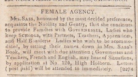
FEMALE AGENCY.

MRS. SASS, honoured by the most decided preference, acquaints the Nobility and Gentry, that she continues to provide Families with GOVERNESSES, Ladies who keep SCHOOLS, with Partners, Teachers, Apprentices, and Half Boarders. Ladies who wish to be accommodated, by setting their names down in MRS. SASS’S Book, will meet with due attention; Governesses and Teachers, French and English, may hear of Situations, by application at No. 120, High Holborn. Letters (post paid) will be attended to immediately.

Maybe our M.B. above should have paid a call on Mrs. Sass and her book. And by the way, here is another respectable profession for a woman—employment agent!

What’s even more interesting is another ad placed in the same issue:

TO THE LADIES. HENRY SASS, corner of King’s-street, Holborn, begs leave to acquaint his Friends and the Ladies in general that he has a large assortment of DRAWINGS, consisting of Figures, &c., on SILK, for Lambs’ Wool Embroidery, ready for sale; also Hearth Rugs, Turkish Cushions, Urn Stands, Table Matts, with Patterns set, and every material for the different Works. Pieces ready worked, and Paintings, on the most reasonable terms, for ready money.—Ladies taught all the different works.

A young Lady wanted as an Apprentice.

***Drawing taught in all its different branches.—Also Painting on China, Glass, and Velvet, in a superior style.—Schools attended.

Ooh, lots to unpack here. First, I assume Henry Sass and Mrs. Sass are related—married? In laws? Second...why hasn’t Henry asked Mrs. Sass to find him a young Lady Apprentice? And third...here is the Regency London equivalent of A.C. Moore—a craft shop! The painting on velvet caught my eye—would they maybe have pictures of Prinny or Lord Byron painted on velvet, instead of Elvis? ;) Lastly, Henry evidently was willing to teach at  schools; a useful service for smaller schools who could not afford a full time art master, or did not want to have one living on the premises along with a bunch of impressionable girls.

What struck you about this week’s ads?

Friday, February 22, 2019

How a Historical Romance Cover Should be Created: A Distance Too Grand Cover Reveal


Very few of us pick up a book without first looking at the cover. Indeed, covers can draw you to a book you wouldn’t have considered otherwise. I have been blessed with some lovely covers over the years. (We won’t speak of the unlovely covers—they tend to get jealous.) But I have never, in working with six different publishers, been treated to a more amazing process than that for the cover of my October 2019 release from Revell, A Distance Too Grand.

Grand is set on the North Rim of the Grand Canyon in 1871 and features a photographer heroine who wrangles her way onto an Army survey team only to discover the man leading the team is the one she thought she had left behind. As is often the case with publishers, I was asked what I thought would make a good cover and provided details on what my heroine and hero looked like, what they wear in the book, and the setting. I expected that to be that. What has generally happened in the past with other publishers is that I would get a nearly finished product at some point and beg to have any inconsistencies fixed. Sometimes timing demanded that those inconsistencies remained to publication. It is what it is.

Not this time.

I first received an e-mail from the Art Director introducing herself and explaining the process. A short while later I received another e-mail from this wonderful person who I intend to hug if I ever meet her in person. She sent a picture of an antique camera.

“Will this do for Meg?” she asked. “Answer quickly, if you can. We want to buy it, and the auction ends today.”

“Yes, yes,” I enthused. “Perfect.”

They bought an antique camera.

Friends, this doesn’t happen. If a publisher wants a suitable looking camera for a cover, someone will find some sort of clipart that sorta, kinda resembles a camera from the 1800s and force-fit it into the composition. Not this time.

The next e-mail provided pictures of a model they hoped to use for Meg. She too was perfect. I was thrilled.

The next e-mail apologized that they could not find a navy riding habit that exactly matched the picture I had sent. Would this dress do instead? I found myself looking at an antique dress from the time period, with a narrow skirt and a bustle. They were going to rent an authentic outfit from the 1870s. Sadly, Meg could not have worn it on horseback on the survey. I made some suggestions about fudging—using a modern riding habit jacket and painting on the right buttons, using a modern A-line skirt.

“Thanks,” she said. “We’ll keep looking.”

The next e-mail offered two cream-colored riding habits of perfect dimensions, also museum pieces that would be borrowed for the photo shoot.

The actual photo shoot.

I agreed the one the Art Director liked was—yes, you guessed it—perfect and waited breathlessly.

And here is the result.


To say I am delighted is the understatement of the year. This is one of the most beautiful covers I’ve ever had, and the most historically accurate. I feel blessed.

I hope you’ll look for A Distance Too Grand in October. If you just can’t wait, it is available for preorder in print now (I expect e-book to come) from Amazon

Isn’t it Grand?

Tuesday, March 14, 2017

Not Regency Fabric, Part 2

Since Rudolf Ackermann sold not only prints in his shop but art supplies as well, it’s hardly surprising that he should make use of his own magazine to get a little advertising in for that side of his business. Back in April of last year we saw samples of fancy papers for crafters; in this issue, we have samples of paper for artists. I don’t pretend to the least technical artistic knowledge, but I’ll comment to the degree that I can to give you a better picture (I hope!) of the thickness and texture of these papers...and maybe the artists among you can chime in. Don’t forget that painting in water-colors was thought to be a necessary skill for young ladies pretending to any degree of gentility, to demonstrate their refinement and properly “feminine” education (I hope that Regina will say a word or two about that!)...definitely the audience Ackermann was targeting.

The overall condition of the page and samples is excellent, considering it is over two hundred years old. I operate under the assumption that the now-cream-colored paper samples were once much whiter but have yellowed due to the acid content of their material, just as the pages of Ackermann’s Repository themselves have done.

In the annexed print, No. 1, is a newly manufactured white cartridge paper, of very superior quality. Those of our readers who have practiced painting in water colours, know that the two great faults of drawing papers are, either that the surface is so smooth, and the texture so hard, that a wash cannot be repeated without disturbing the tint beneath; or, that the paper is partially absorbent, and dries in spots and patches. These evils are completely removed in the paper referred to: it is sufficiently absorbent, it receives the colour freely, and it dries in the flattest tints; and yet, from its granulated surface, it enables the artist to introduce all those accidental varieties, which give to a work of art so much of the sentiment and character of nature. We cannot too warmly recommend this paper, as we are confident, from experience, that it will give universal satisfaction.


My comments:  First things first, what is cartridge paper? It's a heavy paper used for drawing and illustration, according to the dictionary...but was originally used to make cartridges for firearms before metal cartridges came into use...who knew?  This paper sample is definitely textured--it reminds me almost of some of the hand-made craft papers I've seen--but the texture is very even. The weight is similar to cover-stock.

No. 2 is an excellent brown cartridge, which will be found occasionally useful, though not so generally serviceable.


My comments: Pardon my cynicism, but I’m guessing this paper was sold more cheaply than the first. It’s actually a bit sturdier and heavier in weight than the first sample, with a less uniformly fine texture.

No. 3 is a wove vellum paper, of excellent quality. It is here introduced to prevent any misunderstanding on the subject of the first paper. It must be obvious, from the coarseness of the textures of the cartridge, that it cannot be used for any subject which requires accurate detail and delicate execution. Fruit, flowers, shells, and other objects of that nature, then, will require a paper of this kind and quality.


My comments: Definitely much smoother in texture than the first two samples, comparable in weight to, say, a lightweight cover stock (and a little bit lighter than No. 1.) It almost reminds me of construction paper.

In No. 4 we have given a specimen of a good silk paper, for chalk or crayons. It is of an agreeable negative hue, and, by means of red, black, and white chalk, a flesh tint may be produced, the colour of the paper furnishing the harmonizing ground.


My comments: Another sturdy paper, not as smooth as No. 3 but not as heavily textured as the other samples. I'd love to know if this has faded with time or not--right now it's a nice darkish gray color, and would be lovely for chalks or pastels.

Would any artists out there care to comment?

Friday, May 22, 2009

Summer Exhibitionists

The sun is shining, the air is warming—spring is moving into summer, and the bravest are starting to sport some skin! In the nineteenth century there was another way to exhibit oneself in England. One of the highlights of summer was the Royal Academy’s Summer Exhibition. Everyone who could afford the 1-shilling entry fee strolled through the galleries to view paintings and sculpture from England’s most renowned artists.

And a few not so renowned.

The Summer Exhibition, which ran from May to August, was open to amateur artists as well. All you had to do was submit your work of art to a jury of members of the Royal Academy of Art. This Selection Committee deliberated for days to choose around 1,000 works of art to be featured in the exhibit. Supposedly footmen carried in the art and placed it before the jurors, who gazed on it and gave a thumbs up/thumbs down kind of vote. Pieces that received enough thumbs up were allowed in the exhibit.

But there was a second hurdle to jump before a piece actually appeared to the public. Pieces approved by the Selection Committee went before the Hanging Committee, who had the unenviable job of squeezing all the pieces into the galleries for viewing. As you can see from the picture, they literally crammed everything into the space. Sometimes, a painting that was approved by the Selection Committee was rejected by the Hanging Committee because they just couldn’t make it fit!


But can you imagine the excitement of a young lady or gentleman getting that final letter of acceptance? Your work is going to be sitting alongside Constable, Turner, Rowlandson, and other household names of the art world! You got to join these impressive talents a few days before the exhibit opened to schmooze and add “finishing touches” to your piece. And if your piece was hung “on the line,” a railing that ran around the room and served as an anchor for the paintings, that meant you had truly arrived. After all, inferior pieces were hung in the stratosphere, where the audience needed a telescope to see the details.

Today, the opening of the Royal Academy Summer Exhibition is still a red carpet event bringing notables from around the world. What would you expect from a bunch of exhibitionists?